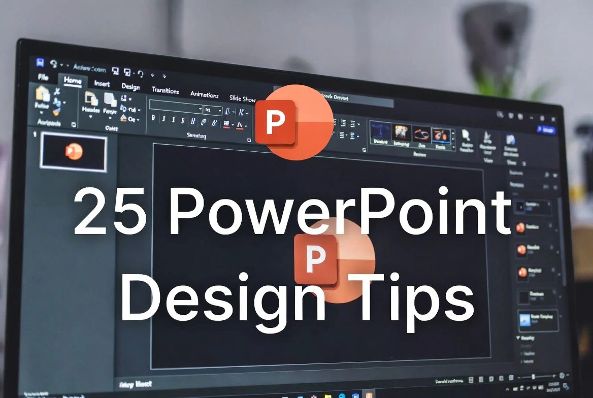
PowerPoint Design Tips for Professional Presentations: 15 Expert Strategies

Callum specializes in breaking down complex technology topics into easy-to-understand guides. He has a background in computer science and technical writing.
Creating professional PowerPoint presentations that captivate your audience requires more than just adding text and images to slides. Whether you're presenting to executives, clients, or colleagues, these 15 design tips will help you create stunning presentations that communicate your message effectively and leave a lasting impression.
Table of Contents
1. Start with a Clear Structure
Before designing, plan your presentation structure:
- Define your core message in one sentence
- Outline 3-5 main points maximum
- Create a logical flow: Introduction → Main Points → Conclusion
- Plan transitions between sections
- End with a clear call-to-action
💡 Tip: Use the 10-20-30 rule: 10 slides, 20 minutes, 30pt minimum font size. This keeps presentations focused and readable.
2. Choose a Consistent Color Scheme
Colors set the mood and reinforce your brand:
- Use 2-3 primary colors maximum
- Choose colors that align with your brand or topic
- Ensure high contrast between text and background
- Use accent colors sparingly for emphasis
- Consider color-blind accessibility (avoid red/green combinations)
Color Psychology:
- Blue: Trust, professionalism, technology
- Green: Growth, sustainability, health
- Orange: Energy, creativity, warmth
- Purple: Innovation, luxury, wisdom
- Dark backgrounds: Modern, dramatic, focused
Image Placeholder
PowerPoint color palette - Professional color schemes for presentations
3. Master Typography
Font choices dramatically impact readability and perception:
- Use maximum 2 font families (one for headings, one for body)
- Sans-serif fonts (Arial, Calibri, Helvetica) for clean modern look
- Minimum 24pt for body text, 36pt+ for headings
- Avoid ALL CAPS except for short headings
- Maintain consistent font sizes throughout
Recommended Fonts:
- Professional: Calibri, Arial, Helvetica Neue
- Modern: Montserrat, Open Sans, Lato
- Creative: Bebas Neue, Playfair Display
- Technical: Roboto, Source Sans Pro
4. Follow the Rule of Thirds
Create visually balanced slides using design principles:
- Divide your slide into a 3×3 grid mentally
- Place key elements at grid intersections
- Avoid centering everything—use asymmetry purposefully
- Leave breathing room around elements
- Align elements to create visual flow
💡 Tip: Enable PowerPoint's gridlines (View → Guides) to help align elements precisely.
5. Use High-Quality Images
Images can make or break your presentation:
- Use high-resolution images (at least 1920×1080)
- Avoid stretched or pixelated images
- Choose images that support your message, not decorate
- Use consistent image styles (photos, illustrations, or icons)
- Consider using full-bleed images for impact
Free Image Resources:
- Unsplash.com - Free high-quality photos
- Pexels.com - Free stock photos and videos
- Flaticon.com - Icons and illustrations
- Freepik.com - Vectors and graphics
6. Embrace White Space
Empty space is a design element, not wasted space:
- Don't fill every inch of the slide
- Give text and images room to breathe
- White space guides the eye to important content
- Margins should be consistent across all slides
- Less content per slide = more impactful
💡 Tip: If you're tempted to make text smaller to fit more, split into two slides instead.
7. Create Impactful Charts and Data Visualizations
Present data clearly and memorably:
- Choose the right chart type for your data
- Simplify: Remove gridlines, reduce labels, eliminate legends when possible
- Highlight the key data point with color
- Use icons to make data more relatable
- Add context: 'Sales up 40%' is better than just showing numbers
When to Use Each Chart:
- Comparison: Bar charts
- Trends over time: Line charts
- Parts of a whole: Pie charts (limit to 5 segments)
- Relationships: Scatter plots
- Single metrics: Large number with context
Image Placeholder
PowerPoint data visualization - Professional charts and graphs
8. Use Consistent Slide Layouts
Consistency creates professionalism:
- Create master slides with your layouts
- Use the same placement for titles, footers, page numbers
- Maintain consistent margins and spacing
- Apply the same transition between all slides
- Use slide templates for repeated content types
💡 Tip: Use View → Slide Master to create reusable layouts. This ensures consistency and saves time on future presentations.
9. Design for Your Delivery Medium
Adapt your design to how it will be viewed:
- In-person: Bold text, simple slides, you provide context verbally
- Video call: Higher contrast, clear visuals, consider screen sharing issues
- Self-running: More detail, automatic transitions, voiceover or notes
- Printed handout: Include more text, use high contrast
💡 Tip: Always test your presentation in the actual environment before presenting.
10. Add Subtle Animations Strategically
Animations should enhance, not distract:
- Use Fade or Appear for most reveals
- Avoid spinning, bouncing, or flashy transitions
- Animate to guide attention sequentially
- Keep animation duration short (0.3-0.5 seconds)
- Use same animation style throughout
Good Animation Uses:
- Reveal bullet points one at a time
- Fade in images when discussing them
- Animate chart elements to tell a story
- Use Morph transition for smooth layout changes
11. Create a Strong Opening Slide
First impressions matter—hook your audience immediately:
- Use a striking visual or bold statement
- Include your presentation title clearly
- Add your name/company subtly
- Consider a full-bleed image with text overlay
- Avoid cluttering with logos and dates
Opening Ideas:
- Provocative question that your presentation answers
- Surprising statistic related to your topic
- Bold statement or promise
- Compelling image that sets the mood
12. Design Effective Closing Slides
End memorably and drive action:
- Summarize key takeaways (3 maximum)
- Include a clear call-to-action
- Add contact information or next steps
- Consider a 'Q&A' slide for discussion
- Don't end with 'Thank You'—end with impact
💡 Tip: Your closing slide often stays on screen during Q&A. Make it useful with key points or contact info, not just 'Questions?'
13. Use Icons Instead of Bullets
Replace text-heavy slides with visual elements:
- Use icons to represent concepts
- Create visual lists instead of bullet points
- Combine icons with short text labels
- Use consistent icon style (filled, outlined, or colored)
- Icons improve retention and engagement
Icon Benefits:
- Faster comprehension than reading text
- More memorable visuals
- Cleaner, more modern look
- Universal understanding across languages
Image Placeholder
PowerPoint icons vs bullets - Modern visual slide design
14. Apply the 'One Idea Per Slide' Rule
Keep slides focused for maximum impact:
- Each slide should convey one main concept
- If you have multiple points, use multiple slides
- Audiences can only focus on one thing at a time
- Simple slides keep audience attention on you
- More slides ≠ longer presentation if you present efficiently
💡 Tip: Test: If you can't explain the slide's purpose in one sentence, split it up.
15. Review and Refine
Polish your presentation before delivering:
- Spell-check all text content
- Verify all links and embedded media work
- Check alignment and consistency across slides
- Review on the actual presentation device
- Test projector/screen compatibility
- Get feedback from a colleague
- Practice timing—aim for 80% of allotted time
- Prepare backup: export to PDF as failsafe
Bonus: PowerPoint Keyboard Shortcuts
Ctrl + M New slideCtrl + D Duplicate slide or objectCtrl + G Group objectsCtrl + Shift + C/V Copy/paste formattingF5 Start presentation from beginningShift + F5 Start from current slideB Black screen during presentationW White screen during presentationSummary: Professional PowerPoint Design
- Plan structure before designing
- Use consistent colors, fonts, and layouts
- Embrace white space—less is more
- Choose high-quality, relevant images
- Design charts for clarity, not complexity
- Use subtle animations strategically
- One idea per slide keeps focus
- Always test and refine before presenting