Excel Pivot Tables for Beginners: Master Data Analysis in 30 Minutes

Callum specializes in breaking down complex technology topics into easy-to-understand guides. He has a background in computer science and technical writing.

Have mountains of data in Excel but don't know how to analyze it efficiently? Pivot tables are Excel's most powerful tool for transforming raw data into actionable insights, and the good news is they're easier to master than you think. In this comprehensive guide, I'll take you from beginner to proficient in just 30 minutes.
What You'll Learn
- What pivot tables are and why they're essential
- How to create your first pivot table step by step
- Advanced filtering and sorting techniques
- Calculated fields and data grouping
- Creating stunning pivot charts
What Are Pivot Tables?
A pivot table is an interactive tool that automatically summarizes large amounts of data. Think of it as a smart assistant that can reorganize, group, and calculate your data with simple drag-and-drop actions—no complex formulas needed.
Why Use Pivot Tables?
What could take hours with traditional formulas is done in seconds. For example, summarizing sales by region, product, and month across thousands of data rows.
Common Use Cases
- Sales analysis: Summarize sales by product, region, or salesperson
- Financial reporting: Group expenses by category and period
- Inventory management: Track stock levels by location
- Human resources: Analyze employee data by department
- Marketing: Measure campaign performance by channel
Preparing Your Data
Before creating a pivot table, your data must be properly formatted. Follow these golden rules for best results:
Data Requirements
- Unique headers: Each column must have a descriptive name
- No blank rows: Remove any completely empty rows or columns
- Consistent data: Each column should contain the same data type
- No merged cells: Merged cells cause errors in pivot tables
Common Mistake
Many beginners struggle because their data contains empty cells or inconsistent formats. Always clean your data before creating the pivot table.
Creating Your First Pivot Table
Follow these simple steps to create your first pivot table in under 2 minutes:
Steps to Create a Pivot Table
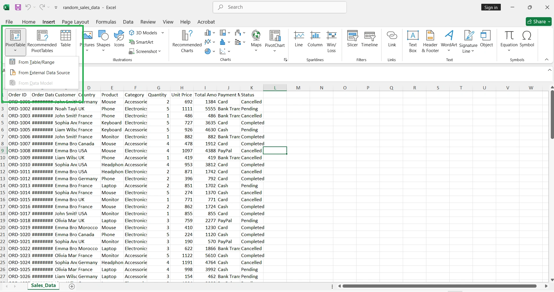
- 1. Select any cell within your data range
- 2. Go to Insert → PivotTable in the ribbon
- 3. Excel will automatically detect the data range
- 4. Choose where to place the pivot table (new sheet recommended)
- 5. Click OK
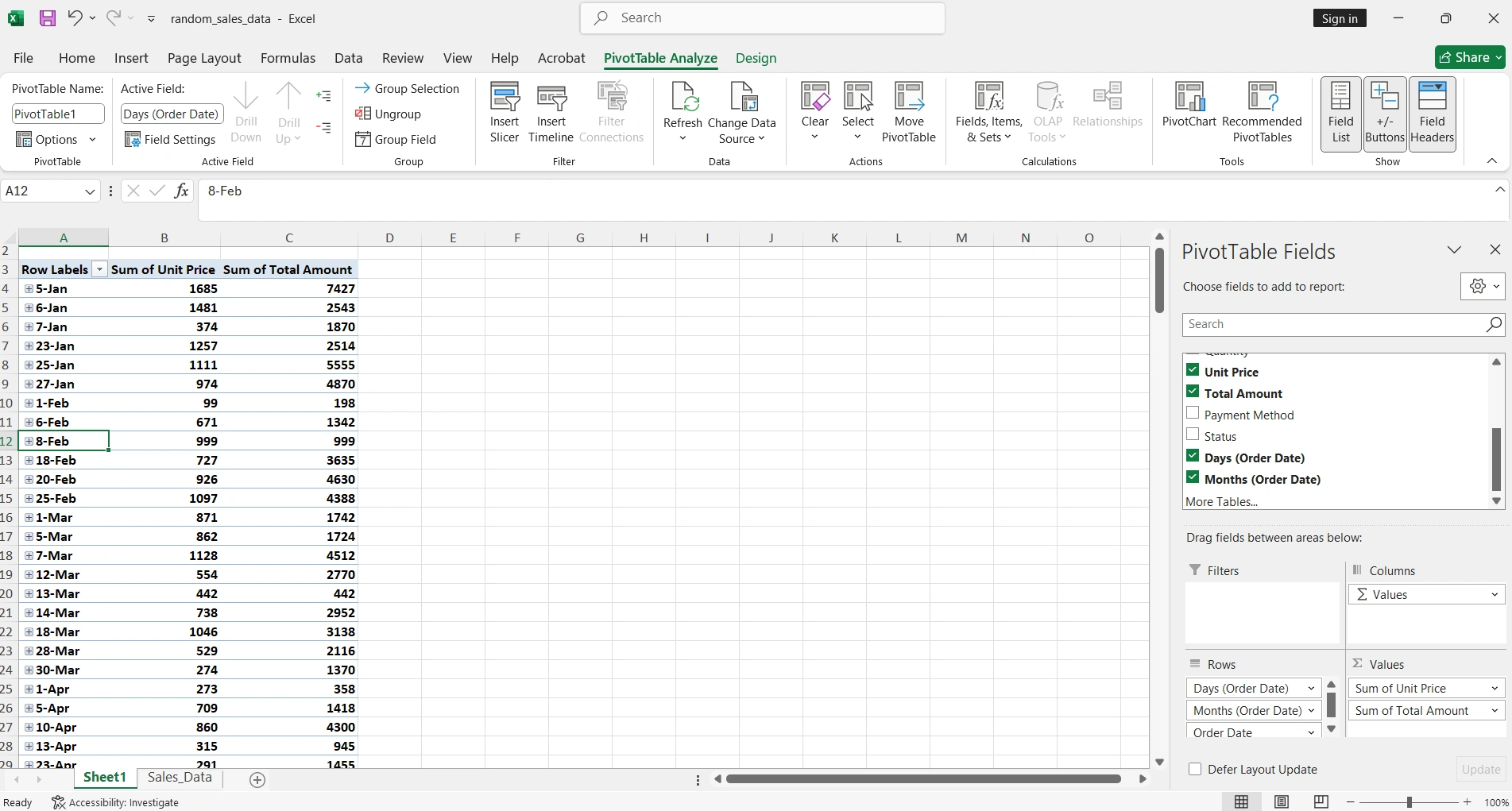
Understanding the Field Panel
Once the pivot table is created, you'll see the field panel on the right with four main areas:
| Area | Function | Example |
|---|---|---|
| Filters | Filters the entire pivot table | Filter by year or region |
| Columns | Creates column headers | Months of the year |
| Rows | Creates row headers | Product names |
| Values | Data to calculate/summarize | Sum of sales |
Advanced Filtering and Sorting
Pivot tables offer powerful filtering capabilities that go beyond Excel's basic filters:
Slicers
Slicers are visual filters that make analysis more interactive and user-friendly:
How to Add a Slicer
- 1. Click any cell in the pivot table
- 2. Go to PivotTable → Insert Slicer
- 3. Select the fields you want to filter
- 4. Use Ctrl + Click to select multiple items
Timelines
If you have date data, timelines let you filter by specific time periods visually:
- Filter by years, quarters, months, or days
- Drag to select time ranges
- Connect multiple pivot tables to a single timeline
Calculated Fields
Calculated fields allow you to create new metrics based on existing data without modifying your original data:
Creating a Calculated Field
- 1. Click on the pivot table
- 2. Go to Analyze → Fields, Items & Sets → Calculated Field
- 3. Name your field (example: "Profit Margin")
- 4. Enter the formula:
=Profit/Sales - 5. Click Add then OK
Useful Calculated Field Formulas
- • Margin %: =(Price-Cost)/Price
- • Growth: =(CurrentSales-PreviousSales)/PreviousSales
- • Commission: =Sales*0.1
Grouping Data
Group data automatically for more meaningful analysis. This is especially useful for dates and numbers.
Grouping Dates
Excel can automatically group dates by years, quarters, months, or days:
Steps to Group Dates
- 1. Right-click any date in the pivot table
- 2. Select Group
- 3. Choose the periods: Years, Quarters, Months, etc.
- 4. Click OK
Grouping Numbers
You can also group numerical values into ranges:
- Ages in 10-year groups (0-10, 11-20, etc.)
- Prices in ranges ($0-$50, $51-$100, etc.)
- Quantities into categories (Low, Medium, High)
Pivot Charts
Pivot charts are connected to your pivot tables and update automatically when you change filters or data:
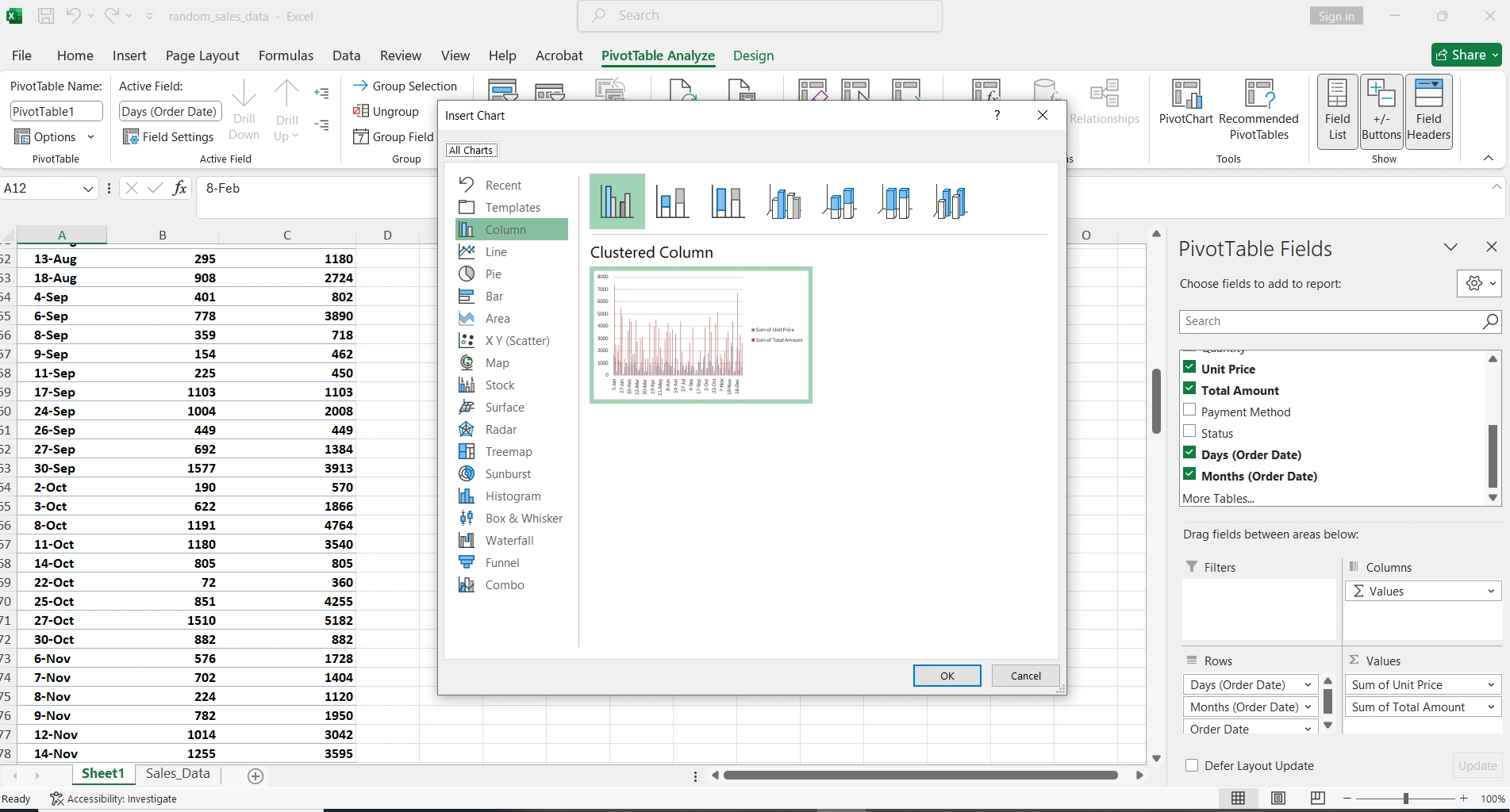
Creating a Pivot Chart
- 1. Click any cell in your pivot table
- 2. Go to Insert → PivotChart
- 3. Select the chart type (column, line, pie, etc.)
- 4. Customize with chart tools
Best Chart Types
| Data Type | Recommended Chart | Use Case |
|---|---|---|
| Comparison | Bar/Column | Sales by product or region |
| Trends | Line | Monthly sales over time |
| Proportions | Pie/Donut | Market share percentage |
| Multiple Series | Combo | Revenue vs. Expenses |
Refreshing and Maintenance
When your source data changes, the pivot table doesn't update automatically. You must refresh it manually:
Refresh Methods
- Right-click → Refresh: Refreshes the selected table
- Analyze → Refresh All: Refreshes all tables in the workbook
- Alt + F5: Keyboard shortcut to refresh
Pro Tip: Use Excel Tables
Convert your data to an Excel Table (Ctrl + T) before creating the pivot table. Tables automatically expand when you add new data.
Advanced Settings
Changing the Calculation Type
By default, Excel sums numerical values. You can change this to other calculations:
- Count: Number of items
- Average: Mean of values
- Max/Min: Extreme values
- Product: Multiplication of all values
- % of Total: Percentage of grand total
Show Values As
Beyond changing the base calculation, you can display values in different ways:
- % of Column/Row Total: Proportions within each group
- Difference From: Change from a base item
- % Difference: Percentage change
- Running Total: Cumulative sum
- Rank: Ranking from smallest to largest or vice versa
Complete Practical Example
Imagine you have sales data with columns: Date, Product, Region, Salesperson, Quantity, and Total. Here's how to analyze it:
Analysis: Sales by Region and Product
- 1. Create the pivot table from your data
- 2. Drag "Region" to the Rows area
- 3. Drag "Product" to the Rows area too (below Region)
- 4. Drag "Total" to the Values area
- 5. Drag "Date" to Columns and group by quarters
- 6. Add a slicer for "Salesperson"
- 7. Insert a stacked column pivot chart
Now you can see sales by region and product, compare quarters, and filter by salesperson with a single click.
Essential Keyboard Shortcuts
| Shortcut | Action |
|---|---|
| Alt + D + P | Create pivot table (classic) |
| Alt + F5 | Refresh pivot table |
| Ctrl + - | Collapse/Expand group |
| Alt + Shift + → | Group selected items |
| Alt + Shift + ← | Ungroup items |
Common Errors and Solutions
Frequent Problems
- "Cannot group that selection"
Dates must be in actual date format, not text. Use DATEVALUE function to convert.
- "(blank)" appears in the data
There are empty cells in your data. Fill them in or filter to hide them.
- Totals don't add up
Check that there's no duplicate data in your source range.
- New data doesn't appear
Refresh the table and verify the data range includes the new rows.
Conclusion
Pivot tables are an essential skill for any professional working with data in Excel. With practice, you'll be able to transform hours of manual work into instant analysis that will impress your colleagues and bosses.
Remember: The key is having clean, well-structured data. Once you master the fundamentals covered in this guide, you'll be ready to explore more advanced features like Power Pivot and data models.
Need Microsoft Excel?
Get Microsoft Office with Excel included at unbeatable prices. Genuine licenses with full support.