Excel Data Analysis for Beginners: From Raw Data to Insights in 10 Steps

Callum specializes in breaking down complex technology topics into easy-to-understand guides. He has a background in computer science and technical writing.

Excel is much more than a spreadsheet tool—it's a powerful data analysis platform that can transform raw numbers into actionable insights for decision-making. Whether you're managing a personal budget, analyzing business sales, or preparing reports for your team, mastering data analysis in Excel will open doors you didn't know existed.
In this guide, I'll walk you through 10 practical steps that will transform you from a basic Excel user into someone who can extract valuable insights from any dataset. No complicated jargon—just real techniques you can apply immediately.
Why Should You Learn Data Analysis in Excel?
Informed Decisions
Stop guessing and start deciding based on real data
Time Savings
Automate repetitive tasks that used to take hours
Better Salary
Data analysis skills are highly in demand
1Organize Your Data Properly
Every successful analysis starts with well-organized data. Before doing any calculations, make sure your information is structured cleanly.
Golden Rules for Organizing Data:
- One row = one record: Each row should represent a single entry (customer, sale, product)
- One column = one data type: Don't mix different information in the same column
- Clear headers: The first row should have descriptive names for each column
- No empty cells: Avoid blank spaces that confuse formulas
Pro Tip: Use Ctrl + T to convert your data into an Excel Table. Tables automatically expand formulas and formats when you add new data.
2Clean Dirty Data
Real-world data rarely comes perfect. Before analyzing, you need to identify and fix common problems.
| Problem | Excel Solution |
|---|---|
| Extra spaces | =TRIM(cell) |
| Inconsistent uppercase/lowercase | =UPPER(), =LOWER(), =PROPER() |
| Duplicates | Data → Remove Duplicates |
| Inconsistent date formats | Use =DATEVALUE() or Text to Columns |
| Numbers stored as text | Multiply by 1 or use =VALUE() |
3Master Essential Formulas
You don't need to know hundreds of formulas. With these 10 functions you'll cover 90% of your analysis needs.
Aggregation Functions
SUM()- Total of valuesAVERAGE()- Arithmetic meanCOUNT()- Count numbersMAX()/MIN()- Extreme values
Conditional Functions
SUMIF()- Sum with criteriaCOUNTIF()- Count with criteriaAVERAGEIF()- Conditional averageIF()- Conditional logic
Practical Example:
If you have a list of sales and want to know the total sold only in "January":
=SUMIF(B:B,"January",C:C)This sums all values in column C where column B says "January"
4Use Filters and Smart Sorting
Filters let you view only the data you're interested in without modifying the original dataset.
How to Activate Filters:
- 1Select any cell within your data
- 2Go to Data → Filter (or use
Ctrl + Shift + L) - 3Use the dropdown arrows in headers to filter by values, colors, or conditions
Advanced Function: Try =FILTER() to create dynamic filtered ranges that update automatically.
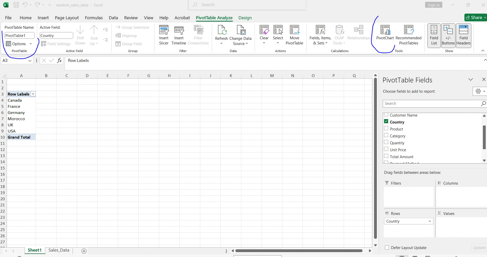
5Create Pivot Tables (Your Best Friend)
Pivot tables are Excel's most powerful tool. They let you summarize thousands of rows of data in seconds with just drag and drop.
Create Your First Pivot Table:
- 1Select your data (including headers)
- 2Go to Insert → PivotTable
- 3Drag fields to the areas: Rows, Columns, Values, and Filters
- 4Done! Experiment by dragging different fields
✓ Use Cases
- • Sales by region and month
- • Expenses by category
- • Performance by employee
- • Inventory by product
⚡ Quick Tips
- • Double-click a value to see the detail
- • Right-click for format options
- • Refresh with right-click → Refresh
- • Group dates by months/years automatically
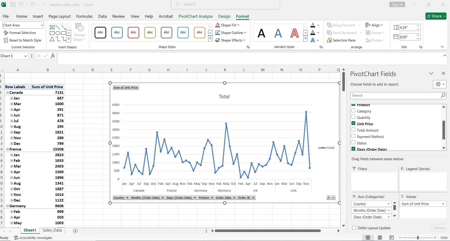
6Visualize with Effective Charts
A good chart communicates in seconds what a table of numbers cannot. Choose the right type based on your message.
| Chart Type | Best For | Example |
|---|---|---|
| Bar | Comparing categories | Sales by product |
| Line | Trends over time | Monthly revenue |
| Pie | Proportions (max 5-6 categories) | Budget distribution |
| Scatter | Relationship between 2 variables | Price vs demand |

7Apply Conditional Formatting
Conditional formatting automatically highlights patterns, exceptions, and trends in your data.
Most Useful Formats:
- Color scales: See high and low values at a glance
- Data bars: Compare magnitudes visually
- Icon sets: Arrows, traffic lights, stars for indicators
Quick access: Select data → Home → Conditional Formatting → Choose a predefined rule or create your own.
8Use VLOOKUP and XLOOKUP to Cross-Reference Data
These functions let you search for information in another table and bring it into your analysis. Essential when working with multiple sources.
VLOOKUP (Classic)
=VLOOKUP(value, table, column, FALSE)- • Searches in the first column
- • Returns value from specific column
- • FALSE = exact match
XLOOKUP (Modern) ⭐
=XLOOKUP(value, lookup_range, return_range)- • More flexible and powerful
- • Searches in any direction
- • Handles errors automatically
9Calculate Descriptive Statistics
Before drawing conclusions, get to know your data well with basic statistics.
| Metric | Formula | What It Tells You |
|---|---|---|
| Average | =AVERAGE(range) | Typical central value |
| Median | =MEDIAN(range) | Middle value (without outliers) |
| Mode | =MODE(range) | Most frequent value |
| Std Deviation | =STDEV(range) | How spread out the data is |
| Percentile | =PERCENTILE(range, 0.9) | Value at certain % of distribution |
10Create a Dashboard to Present Insights
The final step is consolidating everything into a visual dashboard that communicates your findings clearly and professionally.
Elements of a Good Dashboard:
- Key KPIs at the top
- Charts that tell a story
- Interactive filters (slicers)
- Consistent colors
- Descriptive titles
- White space (don't overload)
Your Next Step
You've learned the 10 fundamental steps to transform raw data into actionable insights. The next step is to practice with real data. Download a free dataset from Kaggle or use your own work data.
Recommended Resources:
- • Kaggle.com - Thousands of free datasets to practice with
- • Microsoft 365 - Includes Excel with the latest functions like XLOOKUP
- • Daily practice - 15 minutes a day and in a month you'll be an expert
Need Microsoft Office?
To take advantage of all data analysis features like XLOOKUP, advanced pivot tables, and Power Query, consider getting Microsoft 365 or Office 2024 at reduced prices.